MOBILE PRODUCT DESIGN / REDESIGN CONCEPT
Dandy.
A clearer home for the tasks that keep a home running.
THE SAME APP. A CLEARER HIERARCHY.
A small screen.
More room to focus.
Compare the original with my redesign, then read the decisions below.
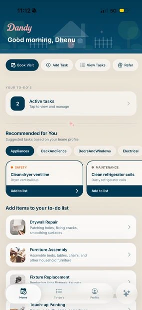
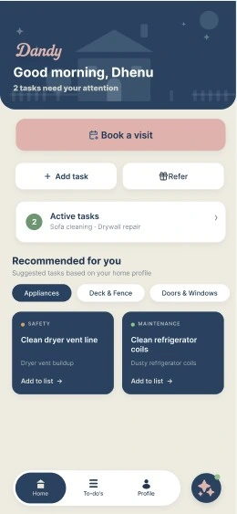
The screen is
a starting point.
Dandy is my self-directed, nine-screen redesign of a handyman app. The scope includes the home screen, task list, booking flow, and an in-app AI assistant. This page previews the home screen; the broader redesign is linked in Figma.
I refined v1 into v1.1 after feedback from the studio, retaining the navy, cream, and pink brand palette and removing a competing search bar. The home screen shown here focuses on a stronger booking action, a useful task summary, and clearer visual grouping. This is a design concept; the next step is to test these choices with people using the app.
The decisions
behind the redesign.
A more personal opening
The greeting and remaining task count appear together at the top of the exploration, giving the home screen a clearer starting point.
A prominent booking action
The booking action sits directly below the greeting in a contrasting pink area. The task list follows below it.
Stronger visual grouping
The navy header, booking area, and cream task section separate the parts of the screen through colour and spacing.
What I would
investigate next.
- Can someone identify the next task without being guided?
- Is booking the right primary action for a returning user?
- Do the text, contrast, and touch targets remain usable across screen sizes?
These are next questions to test. Research findings and validated results are not documented for this exploration.
Browse the Figma file in a new tab